MeisterSinger has always had a slightly unusual relationship with time. While much of watchmaking is built around precision, fractions of seconds and ever more complicated displays, MeisterSinger has spent years doing almost the opposite. Its watches slow the process down, stripping the dial back to a single hand and asking the wearer to read time in a broader, calmer way.
The latest Pangaea releases continue that philosophy, but with a dial treatment that is far more intricate than the simplicity of the display might first suggest. Three versions form the new group: the Pangaea Steel Blue PDS917G in full stainless steel, the Pangaea Steel Blue PDS917GLG with a gold-coloured PVD bezel, and the Pangaea Silver PDS901B. Mechanically and conceptually, they are closely related, but each has its own character. The blue steel version is cool and restrained, the gold-bezel model adds warmth and a touch of formality, while the silver version relies almost entirely on texture and changing light for its personality.
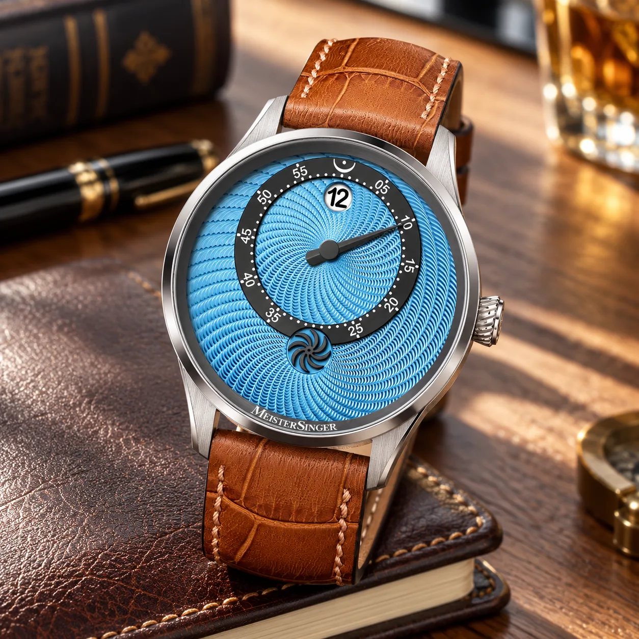
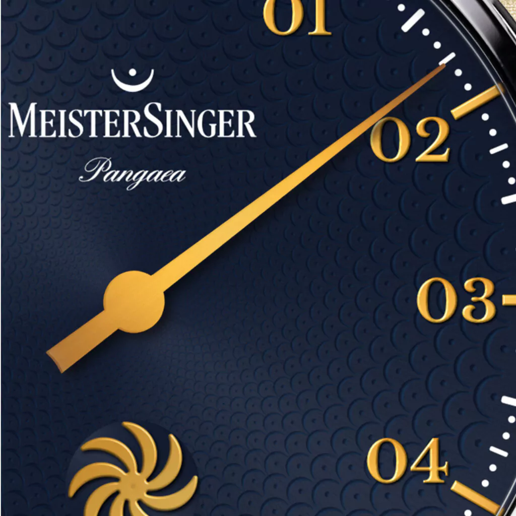
What unites them is the dial. Look closely and the textured surface is not a random geometric pattern at all. It is made from countless tiny fermatas, the musical symbol for a pause and MeisterSinger’s own emblem. In music, the fermata allows a note or rest to be held longer than its written value. The exact duration is left open to interpretation, which makes it particularly fitting for a watchmaker that has built its identity around loosening the wearer’s obsession with exact minutes and seconds.
It is a clever idea because the symbol works on more than one level. From normal viewing distance, the fermatas merge into an intricate kaleidoscopic texture. Move the watch through the light and sections of the pattern appear to rise and recede, changing the character of the dial without actually changing its structure. Only when viewed more closely do the individual symbols become obvious. That gradual reveal makes the design feel considered rather than gimmicky. The pattern is attractive even before its meaning is understood, and the symbolism simply adds another layer afterwards.
A Detailed Dial That Still Feels Calm
The risk with a surface this busy is obvious. A MeisterSinger still needs to be easy to read, perhaps more so than a conventional watch, because one hand is doing the job normally shared by two. The new Pangaea manages that balance surprisingly well. Applied two-digit hour numerals provide the strongest reference points, while more discreet dots indicate five-minute intervals. Quarter and half hours are given slightly more emphasis, helping the eye establish position quickly without turning the dial into a mass of scales and markings.
The single hand remains the centre of the experience. It moves slowly around the dial, indicating both hours and minutes with enough precision for everyday life, but without pretending that every passing second needs attention. At first, the idea can seem almost intentionally imprecise, but that is not really what MeisterSinger is doing. The watch is mechanically capable of keeping time in the usual way. It simply chooses not to present all of that information to the wearer.
That distinction matters. The Pangaea is not about poor accuracy. It is about changing the way accuracy is consumed. Instead of constantly confirming whether it is exactly 10:23 or 10:24, the wearer sees that it is a little after twenty past ten and carries on. In a world where phones, computers and smart devices already make exact time unavoidable, there is something appealing about a mechanical watch that intentionally refuses to compete with them.
The dial also includes one of the more charming details in the new collection, the MeisterSinger Sun Wheel. It rotates once every minute, providing a subtle visual reminder that the movement is alive. Importantly, it does not behave like a traditional seconds hand. There is no scale around it and no reason to count its progress. It adds motion without adding more information.
That makes it feel particularly well suited to the MeisterSinger philosophy. A conventional seconds hand constantly measures and announces the passing of time. The Sun Wheel simply moves. It gives the dial life without undermining the serenity created by the single-hand layout, and it solves one of the few practical drawbacks of a watch without a seconds hand, namely that the dial can otherwise appear completely static.
Three Versions, Three Different Personalities
The full stainless-steel Pangaea Steel Blue PDS917G is probably the most restrained of the three. The steel case does not compete with the dial, allowing the blue colour and textured fermata pattern to become the main visual attraction. There is a coolness to the overall presentation that makes it feel contemporary and versatile, particularly for someone who likes the MeisterSinger concept but prefers a watch that does not draw attention through precious-looking finishes or strong contrast.
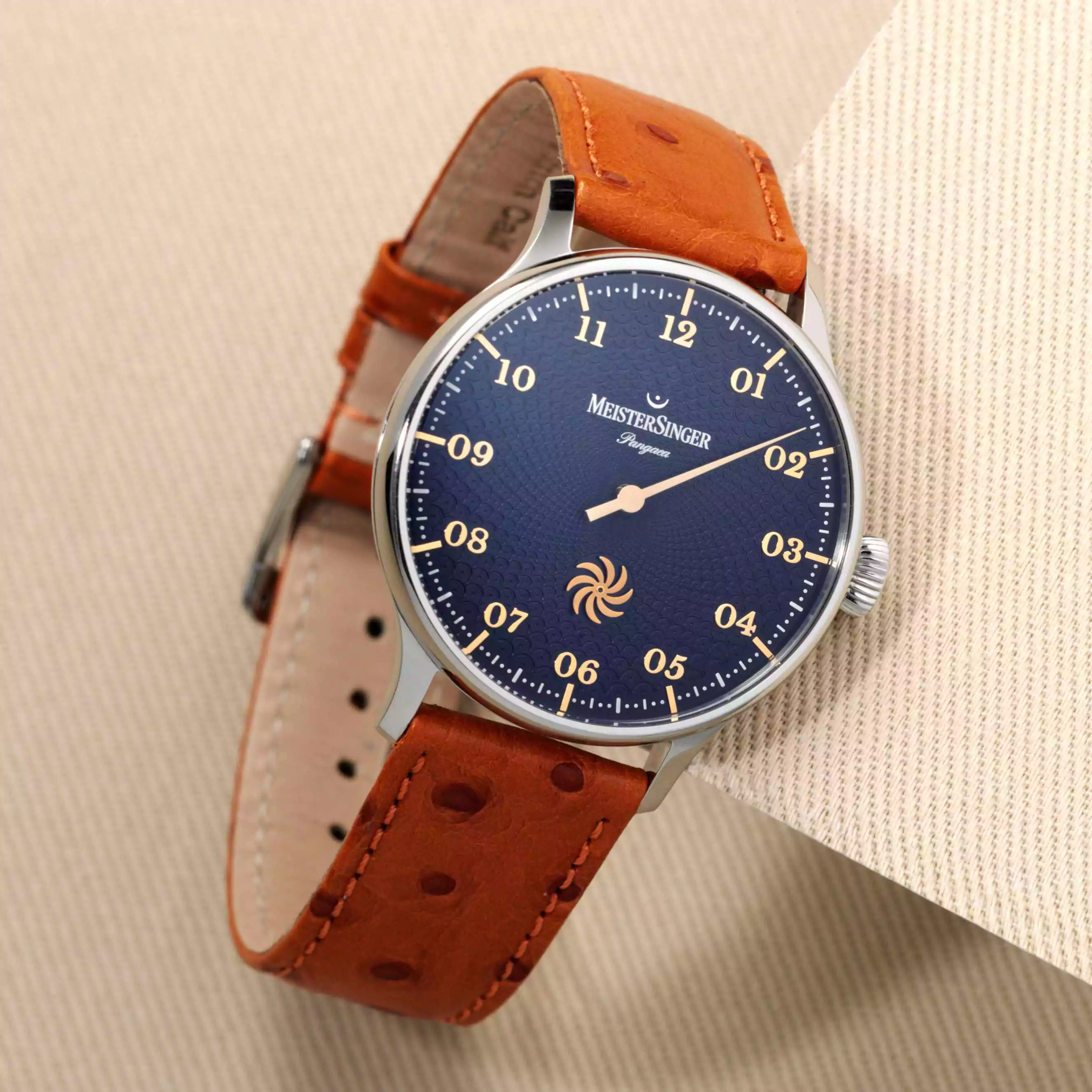
The blue dial itself changes considerably with the light. At some angles it appears deep and relatively calm, while at others the pattern becomes more visible and the surface gains an almost layered quality. The full steel case suits this behaviour because it creates a neutral frame around the dial. Nothing interrupts the relationship between colour, texture and the single hand. Of the three models, this is perhaps the easiest to imagine as an everyday watch.
The Pangaea Steel Blue PDS917GLG takes exactly the same dial idea and changes the mood with one relatively small alteration, a gold-coloured PVD bezel. It is a good example of how a single design decision can have a surprisingly large effect on a watch. The gold tone creates a warmer frame around the blue dial and gives the model more visual presence, yet the stainless steel case remains visible enough to stop it from becoming overly formal.
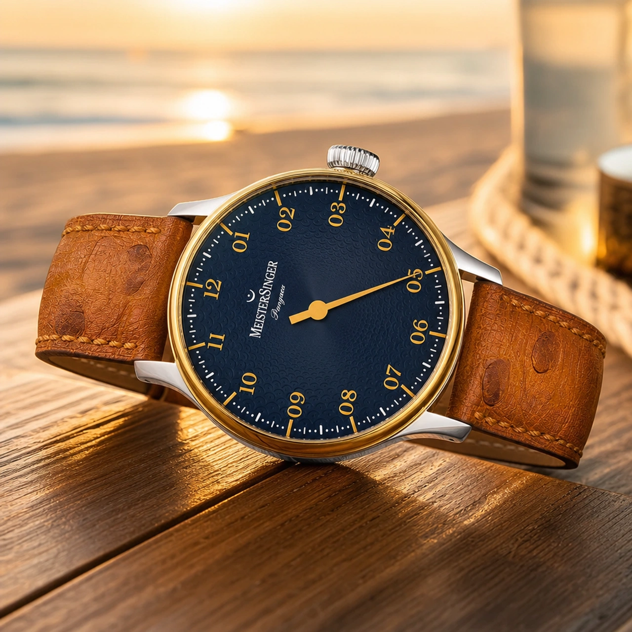
The combination works because MeisterSinger has resisted coating the entire case in gold colour. Had it done so, the watch might have drifted too far towards a traditional dress-watch aesthetic. Instead, the bezel acts almost like a fine picture frame, drawing the eye inward towards the dial while leaving the rest of the case more contemporary. It is the most expressive of the three models, but it still feels recognisably Pangaea rather than a completely different watch.
The Pangaea Silver PDS901B takes another direction entirely. Without the stronger blue colour, the texture becomes the star of the dial. Silver is sometimes treated as the safe or conservative choice in watchmaking, but here it feels anything but plain. The lack of saturation makes the eye more sensitive to the pattern itself, as well as the small differences in reflection between the applied numerals, markers and textured surface beneath them.
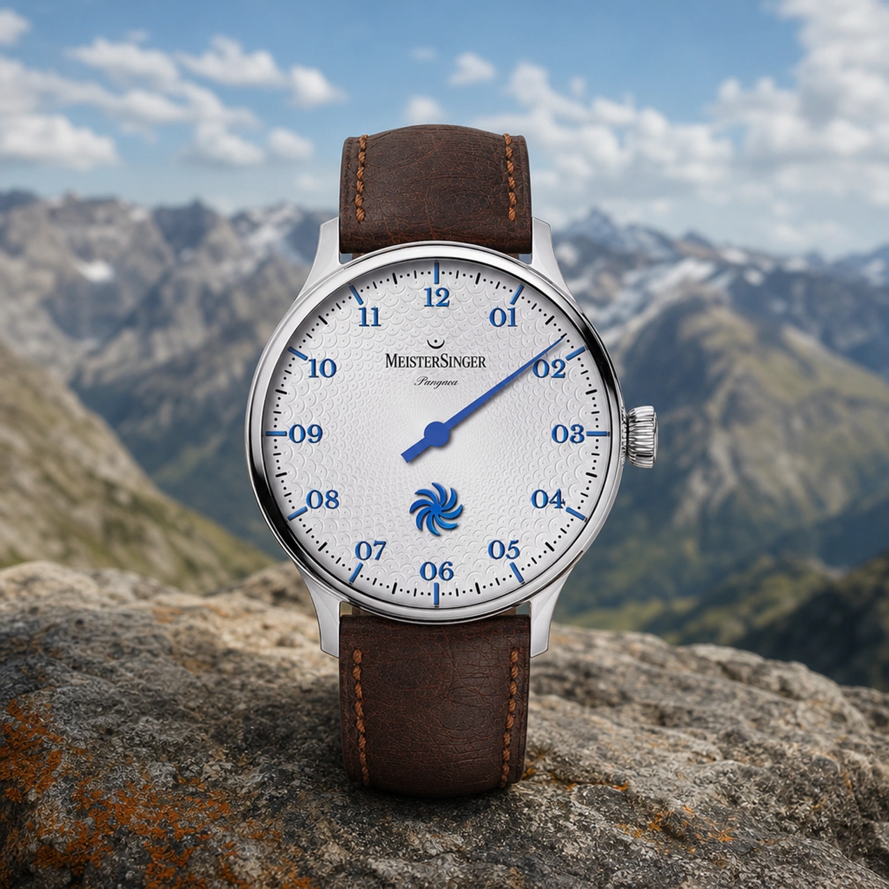
In subdued light, the silver version can look almost classical. Then the angle changes and the fermata pattern begins to break through, giving the dial far more depth than the colour description alone would suggest. It is perhaps the most subtle version at first glance, but also the one that rewards close inspection the most. Rather than relying on colour for impact, it relies on light, structure and relief.
This also makes the relationship between dial and case particularly cohesive. The stainless steel and silver tones sit close together visually, so the watch feels almost monochromatic. The separation between elements comes from finishing rather than colour contrast, which gives the PDS901B a more architectural character than the blue models. For collectors who prefer detail that reveals itself slowly, this may be the strongest of the three.
The Pangaea Case Still Makes Sense
All three models share the same 40 mm stainless steel case, measuring 11.7 mm in height with a 20 mm lug width. Those dimensions are well suited to MeisterSinger’s single-hand format. The dial needs enough physical space for the scale to remain legible, but the watch also needs to retain the elegance that has long been associated with the Pangaea line. At 40 mm, there is enough room for the applied markers and fermata texture to breathe without the watch feeling oversized.
Sapphire crystal protects the front, while the exhibition caseback allows the automatic movement to be viewed through mineral glass. The caseback is secured by six screws and water resistance is rated to 5 bar, which is entirely appropriate for an elegant everyday watch rather than a dedicated sports model. Nothing about the case is trying to dominate the conversation, and that is exactly why it works. The Pangaea is a dial-led watch, and the case provides structure without competing for attention.
Inside is the Swiss Sellita SW261 automatic movement, specially modified for MeisterSinger’s single-hand display. It provides approximately 38 hours of power reserve and can be viewed through the exhibition back. Some collectors will always prefer an entirely in-house calibre, but in the context of the Pangaea the movement choice makes sense. MeisterSinger’s originality is concentrated in the way the watch presents time, not in attempting to reinvent every component beneath the dial.
There is also something pleasing about the contrast between the front and back of the watch. From the dial side, time appears relaxed and almost slowed down. Turn the watch over and the mechanical reality is visible. The rotor moves, the gear train turns and the escapement continues working constantly. The machine is every bit as active as any other automatic watch. The difference is simply in how much of that activity is communicated to the wearer.
Why the Fermata Pattern Works So Well
The more time spent with these three watches, the more important the fermata becomes. It is not simply a decorative motif and it is not just an exercise in repeating the brand’s logo across the dial. Its meaning is unusually well matched to the watch itself.
In music, a fermata temporarily relaxes the strict structure of timing. The written note has a duration, but the performer is given freedom to extend it. MeisterSinger is doing something similar on the wrist. The movement still measures time mechanically, but the dial allows the wearer to interact with that information in a less rigid way. Exact seconds continue to pass, but the watch does not insist that they need to be watched.
That gives the new Pangaea dials a level of coherence that many decorative updates lack. Every major element points in the same direction. The single hand reduces visual urgency. The five-minute scale provides enough information without clutter. The Sun Wheel creates motion without encouraging the wearer to count seconds. The fermata texture turns the idea of pause into part of the physical design itself.
This is also where MeisterSinger’s approach to independent watchmaking remains interesting. Independent watches are often associated with spectacular mechanics, exotic materials or extraordinarily complicated movements, and there is nothing wrong with that. But independence can also be about having a recognisable point of view. MeisterSinger has one of those. A single glance at the dial is enough to know that this company approaches time differently.
The new Pangaea collection does not abandon that identity in search of novelty. Instead, it deepens it. The watches are still unmistakably MeisterSinger, but the new dial treatment gives the philosophy more visual substance. There is more to look at, yet the watch still feels calm. There is more texture, but not more noise. There is movement on the dial, but not more information demanding attention.
Which Version Makes the Strongest Case?
Choosing between the three ultimately comes down to personality rather than specification. The PDS917G Steel Blue is the most straightforward and versatile, with the all-steel case allowing the blue dial to do the talking. The PDS917GLG Steel Blue adds warmth and a stronger sense of occasion through its gold-coloured bezel, without becoming overtly dressy. The PDS901B Silver is the most understated initially, but arguably the most interesting once the light begins to reveal the texture across its dial.
There is no mechanical advantage to one over another. All three are built around the same concept, and that is part of their appeal. Rather than creating artificially different personalities through complications or specification changes, MeisterSinger has allowed colour, contrast and finishing to shape the experience. It is a subtle approach, but an effective one.
Final Thoughts
The new MeisterSinger Pangaea models are successful because they do not feel like colour variations created simply to fill out a collection. The fermata-pattern dial gives them a genuine point of difference, while the Sun Wheel adds just enough movement to keep the watch visually alive without compromising the simplicity of the single-hand display.
The three versions then interpret that idea in distinct ways. The full-steel blue model is cool and contemporary, the gold-bezel version is warmer and more expressive, and the silver model lets texture become the defining feature. Each feels related, but none feels redundant.
More importantly, the design makes sense in the context of MeisterSinger. The brand has always challenged the idea that a watch needs to report time with the same urgency as every other device around us. These new Pangaea models take that philosophy and quite literally work it into the surface of the dial.
In an age where almost every screen, notification and digital tool is designed to make time feel scarce, urgent and measurable, there is something quietly appealing about a mechanical watch covered in symbols for pause. The movement keeps counting every second. The Sun Wheel keeps turning. The day continues at exactly the same pace as before. MeisterSinger simply chooses to present it with a little less pressure.
That is what makes these new Pangaea releases interesting. They are not trying to do more. They are simply finding a more thoughtful way to do less.