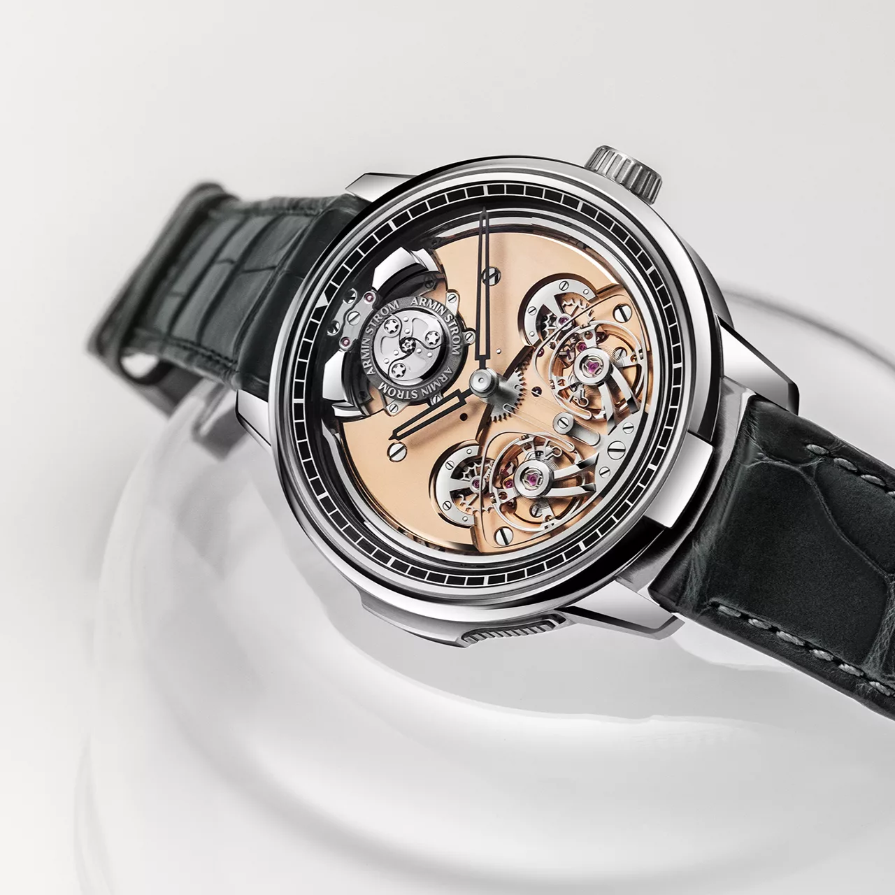
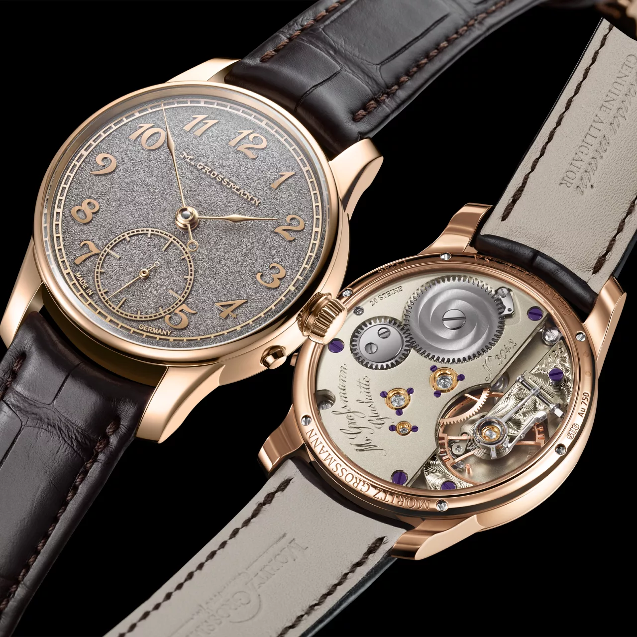
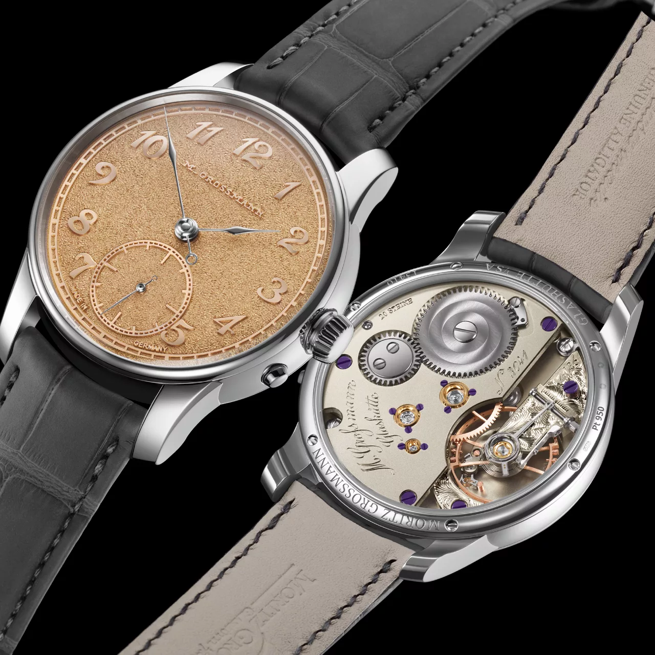
Legibility has always sat at the heart of German instrument watchmaking. Long before watches became expressions of personal style, they were tools, relied upon in cockpits, on decks, and in environments where a quick, accurate reading mattered far more than decoration. German watchmakers have carried this mindset forward, refining it through materials science, dial design, and a disciplined approach to lume that prioritises function over flourish.
What sets German brands apart is not simply how much luminous material is applied, but how deliberately it is used. Legibility begins with contrast. High-contrast dials, carefully proportioned hands, and restrained typography ensure that time can be read instantly in daylight. Lume then becomes a supporting element rather than a crutch, reinforcing visibility in low light without compromising clarity during the day.

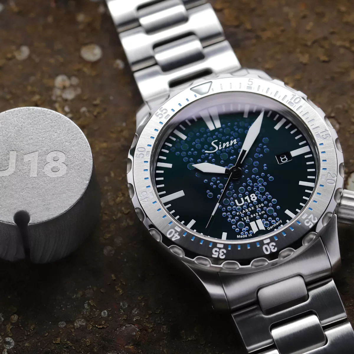
Full luminous dials are one of the clearest examples of this philosophy in practice. Brands such as Sinn, Hanhart, Mühle-Glashütte and Tutima have refined the use of fully lumed surfaces so they remain readable in bright conditions while offering exceptional visibility in darkness. The choice of lume colour is never arbitrary. Green lume is often favoured for its longevity and brightness, while blue lume is used more sparingly, offering a softer glow that can reduce glare in operational settings.
This careful balance extends to the way information is prioritised on the dial. Luminous markers are sized and positioned to draw the eye to the most critical elements first, hours and minutes, followed by secondary information only where necessary. In many German tool watches, date displays are either minimised or colour-coded so they do not disrupt the visual hierarchy, particularly when lume is active.

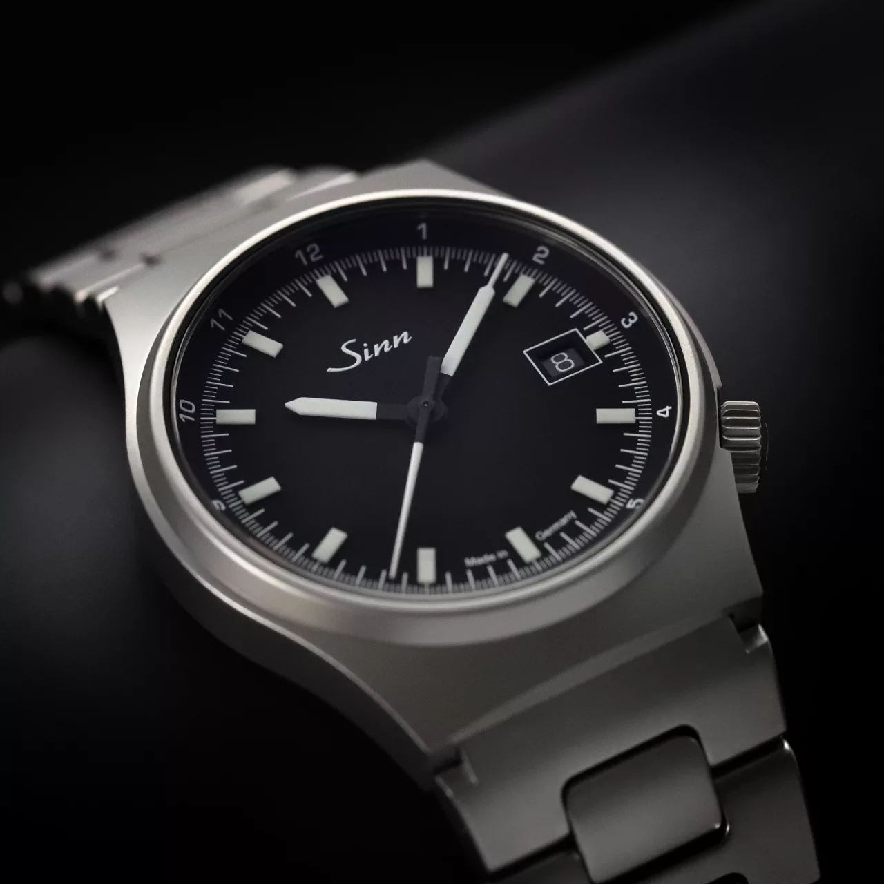
Luminous markers, rather than full dials, remain the preferred solution for many pilot and mission-style watches. This approach allows for precise differentiation between hands and indices, especially when multiple timekeeping elements are present. Sinn’s use of differently coloured lume on hands and markers is a well-considered solution, helping the wearer instantly distinguish hours, minutes, and seconds in darkness without visual confusion.
Materials play a crucial role in how lume performs over time. Modern photoluminescent compounds such as Super-LumiNova and Chromalight are non-radioactive, stable, and capable of maintaining strong luminosity for years. German manufacturers are particularly selective here, often applying lume in thicker, more consistent layers to ensure even glow and reliable performance rather than chasing novelty colours or extreme brightness at the expense of longevity.

The appeal of old radium-style lume highlights another aspect of German design thinking, respect for heritage without compromising safety. Vintage watches produced before the 1960s often used radium-based paint, valued for its constant glow but later banned due to health risks. Today, brands such as Sinn, Hanhart, Mühle-Glashütte and Tutima recreate this warm, aged aesthetic using modern pigments. The result is a dial that nods to historical military and aviation watches while remaining entirely safe and practical for daily wear.
Design clarity underpins every decision around lume. German instrument dials are rarely busy, and trends are deliberately avoided. Numerals are chosen for maximum readability, hands are shaped to be instantly recognisable, and spacing is carefully judged so that lume enhances rather than overwhelms. This is why many of these watches remain legible at a glance even without any luminous material activated.

Brands such as Damasko, Sinn, Hanhart, Mühle-Glashütte and Tutima exemplify this functional restraint. Their watches do not rely on excessive lume or dramatic contrasts to make an impression. Instead, they achieve clarity through proportion, thoughtful layout, and an understanding of how the human eye reads information under different lighting conditions.
Having spent years working closely with these independent manufacturers, it becomes clear that legibility and luminosity are never treated as afterthoughts. They are engineered into the watch from the earliest design stages, tested under real-world conditions, and refined until the balance feels right. This is not about standing out in a display cabinet, but about delivering confidence on the wrist.

Ultimately, the German approach to lume and legibility reflects a broader philosophy of watchmaking. Form follows function, materials are chosen for performance, and heritage informs rather than dictates design. The result is a collection of watches that remain calm, capable, and quietly assured, whether viewed in full daylight or complete darkness.

In a market increasingly driven by spectacle, this disciplined focus is a reminder of what mechanical watches were originally made to do. Tell the time clearly, reliably, and without distraction. German watchmakers continue to take that responsibility seriously, and it shows every time the lights go out.